Our Work
GET YOUR FREE
MARKETING AUDIT.
Our Work
GET YOUR FREE
MARKETING AUDIT.
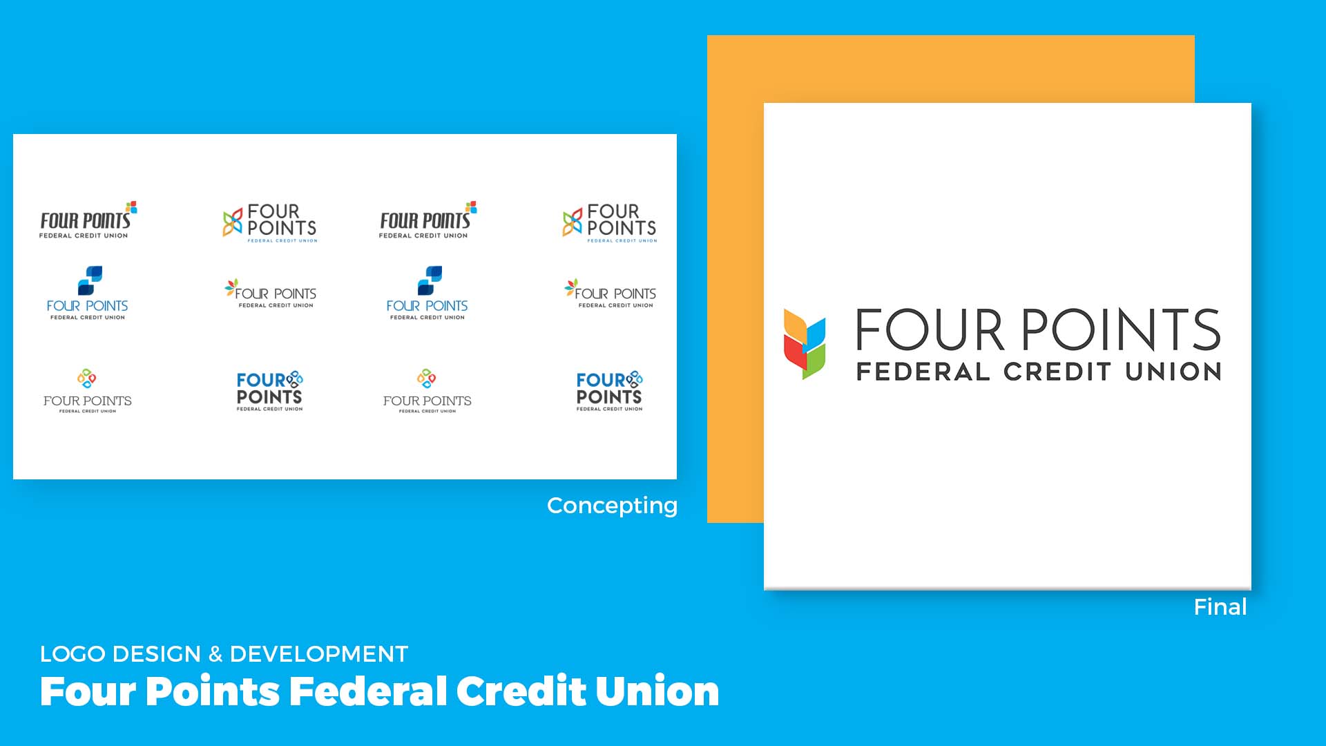
When we were initially working with the Four Points brand we knew we wanted to make the logo have natural elements and with that we created the 4 seeds, which represent 1 of the 4 life points. The focus on color was essential to the logo and brand and what each color represents. Harvest Yellow for golden-agers looking toward a new season of growth, Adventure Blue for a balanced family, Quest Red for the young adult to master, and Dream Green for kids.

When we were developing the Four Points brand, we knew that we needed to create a booklet for the credit union to give to members that went over the benefits of the bank, the four points, and their services. We also created an all encompassing brand guide for usage of all the brand assets; from what type of photos and icons, to the meaning behind the colors.
To keep with the brand standard we created for Four Points FCU, we have continued to produce styled flyer ads for various offers and services.
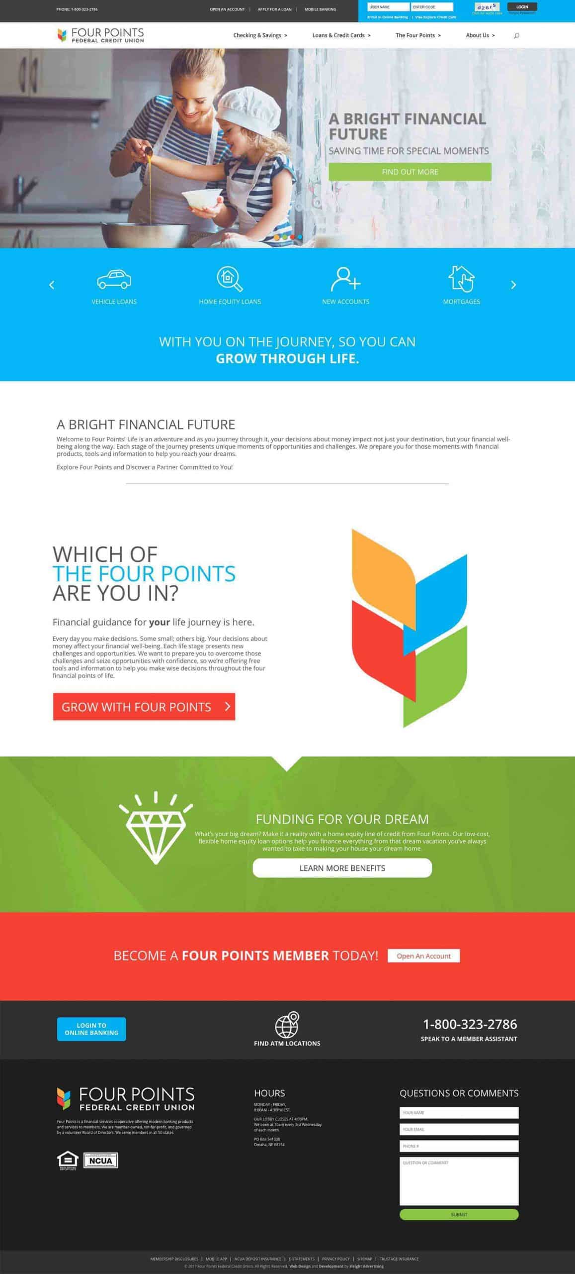
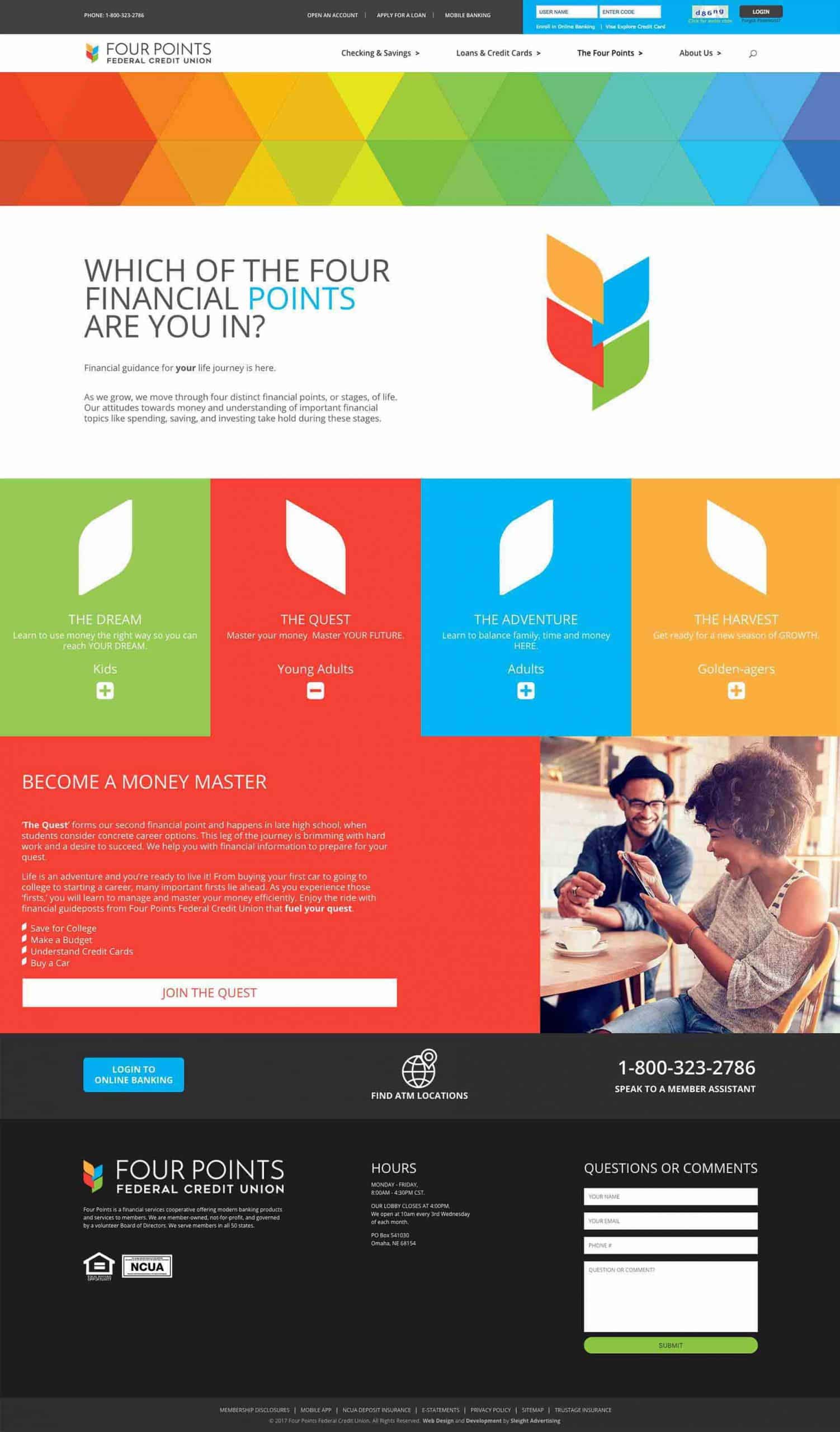
The Four Points FCU Mobile Responsive site was created with the four points or stages of life that their brand is based on. Colors from the logo were included throughout the site, and the focus was to educate members and show them services geared toward the point of life that they are in (ex: Red represent Young Adult; auto loans, mobile banking, personal loans). We also felt that including people-driven photography would help convert users to members.

