Our Work
GET YOUR FREE
MARKETING AUDIT.
Our Work
GET YOUR FREE
MARKETING AUDIT.
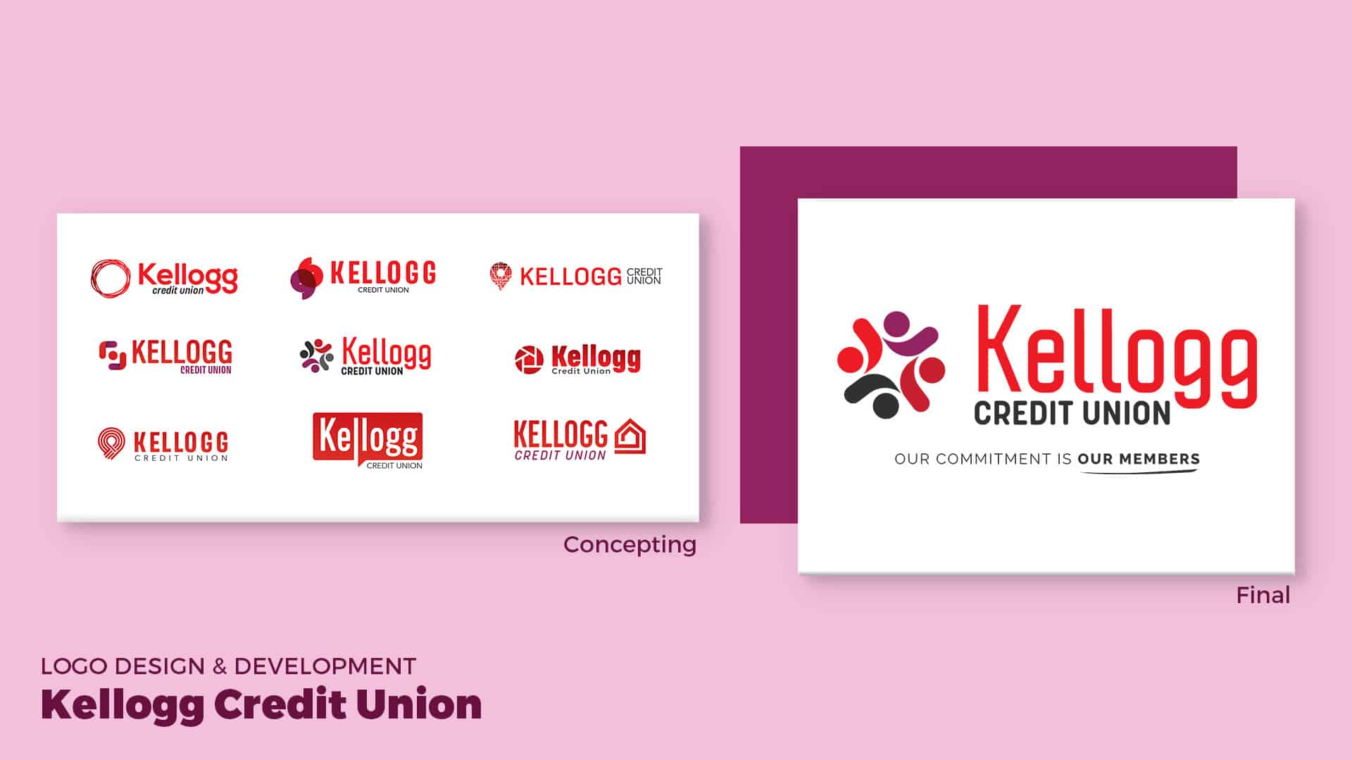
Kellogg Credit Union is a small credit union located in Omaha, Nebraska that serves current employees or family members of The Kellogg Company. While working with them on SEO, they approached us about updating their look to be more modern and overall refreshing the brand. We began with a brand analysis to determine their target audience, strengths, weaknesses, and competitors. We worked closely with key members to define their mission statement, how they wanted to be positioned, and their core values. When it came to developing a look for the logo, we reviewed our brand strategy and focused on how they connect with their members. We wanted to represent how they get to know them on a personal level and how they always strive to do what is best for the member. After a few rounds of logos, we honed in on a logo that represents the members and the community. The main “Kellogg” font is modern and clean with a softer “Credit Union” under it. We chose to retain the original reds and add a youthful pop of fuchsia to brighten it up. We utilize images that evoke happiness, security, and the connection Kellogg has with its members.

Sleight Advertising created a detailed brand guide that encompasses Kellogg’s mission and identity. This guide can be used internally and externally to keep the brand consistent.
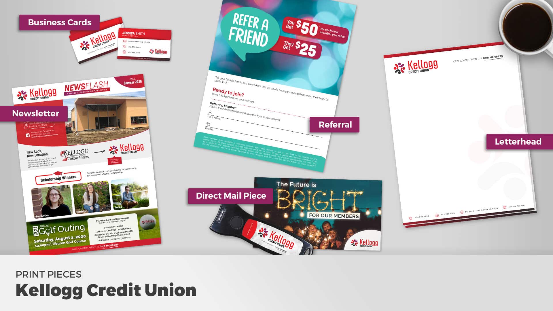
We designed a series of items to launch Kellogg’s new brand. The direct mail piece announced to their members of a bright new look and future for the credit union. We redesigned their newsletter to reflect the new brand and helped organize the content. Stationary was designed to match the new look, as well as, one-sheets.
