Our Work
GET YOUR FREE
MARKETING AUDIT.
Our Work
GET YOUR FREE
MARKETING AUDIT.

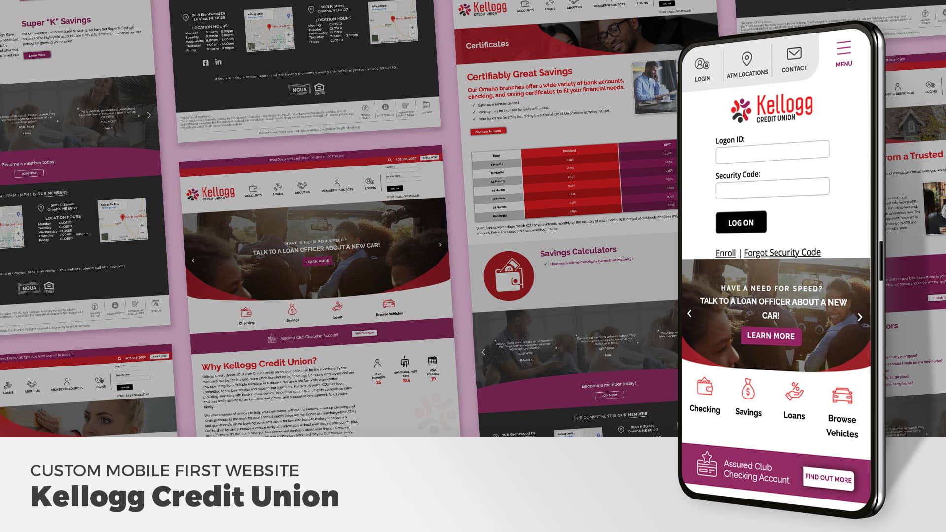
Upon completing Kellogg’s branding we proceeded forward with designing and developing their mobile-first website. They asked for a site where their members could quickly access the logins, ATM locations, and contact form. They also wanted to make it easy for new members to enroll. When designing mobile-first websites we place the items that users need the most “above-the-fold.” On Kellogg’s, we included a vivid slider, 4 prominent service areas (checking, savings, loans, browse vehicles), and a call-out to the Assured Club Checking Account. Going down the homepage we give a little information about the credit union, some stats, a video, a call-out section for car shopping with an animated car, blogs, and their commitment. Overall, the site is easier to navigate and matches their new branding.

